It’s time to fall in love again with five beautiful, new Stampin’ Up! In Colors. Stampin’ Up! captured the hottest fashion and home d?cor trends with their soon-to-be released palette of Primrose Petals, Summer Starfruit, Midnight Muse, Gumball Green and Raspberry Ripple. Coordinating In Color card stock, designer series paper, ribbon and more will be available for customer purchase starting June 1, when the Stampin’ Up! 2012-2013 Catalog officially begins.
PRIMROSE PETALS: Each one of the color trios on my card samples compares a new Stampin’ Up! In Color (always in the center) with two similar, current colors. From top to bottom above: Rose Red, Primrose Petals, Melon Mambo. Primrose Petals is warmer than Rose Red and dustier than Melon Mambo. Think strawberries and cream!

SUMMER STARFRUIT: It reminds me of retired Stampin’ Up! color Kiwi Kiss with a squeeze of lemon. From top to bottom: Lucky Limeade, Summer Starfruit, Daffodil Delight. SNEAK PEEK: Don’t you love the Itty Bitty Banners Stamp Set (Wood-Mount 125255, Clear-Mount 126257) and coordinating Bitty Banners Framelits (129267). Both will be available June 1.

MIDNIGHT MUSE: Deeper than Not Quite Navy (top) and richer than Night of Navy (bottom), Midnight Muse (center) is a sumptuous, modern blend with a hint (and I mean “hint”) of green. SNEAK PEEK: That sweet strip of butterflies is from Patio Party Designer Series Paper (126916). Available June 1.

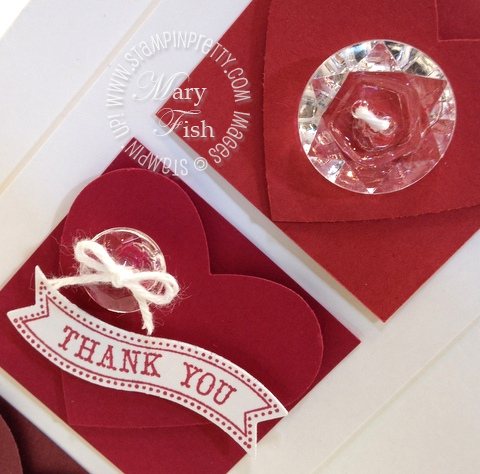
RASPBERRY RIPPLE: This hip, pinky red is bluer than Riding Hood Red (top) and charged with more vavoom and less brown than Bravo Burgundy (bottom). Raspberry Ripple wil speak the language of love on many of your projects.

SNEAK PEEK: Reminiscent of vintage door knobs and pulls. The Vintage Faceted Designer Buttons (127555) will guarantee the “bling factor” in your paper crafting projects. Available June 1.

GUMBALL GREEN: More saturated than Wild Wasabi (top) and brighter and warmer than Garden Green (bottom), Gumball Green fulfills your search for the perfect Christmas holiday green. This crisp, beautiful green is striking with red but will be a “go to” green for many of us!

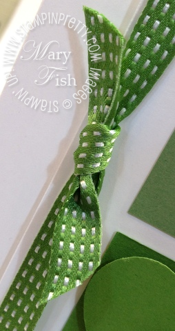
SNEAK PEEK: One of my favorite things about Stampin’ Up! products is that everything coordinates. I can spend less time matching and more time playing. This luscious Green Gumball 3/8″ Stitched Satin Ribbon (126848) will be available on June 1.

FILL YOUR STAMPIN’ UP! WISH LIST! $99 KIT NOW AVAILABLE! Stampin’ Up! is offering a brand new style of Starter Kit for $99 and YOU are in charge of what goes into it. Perfect for the hobby or business stamper! Get the details on the NEW STAMPIN’ UP! $99 STARTER KIT.


There are many patterns of designer series paper that include Watercolor Wonder. I recommend the 2015-2017 In Color Designer Series Paper Stack (12 x 12 138432) since it will have card friendly patterns in Watercolor Wonder as well as the other 4 In Colors. I you want something that mixes colors with Watercolor Wonder, I suggest the Pretty Petals Designer Series Paper Stack (6 x 6, 138442)
The cards are adorable. I would love to win.
Mary,
Thank you for always being my “go to” when I’m having a bout of “stampers block”! One quick peak @ your site, and boom! I am inspired and ready to create!
I love your crisp and clean approach. SU! sure is lucky to have you…but we are luckier! ;o)
Hi Mary…your talent for making cards is so inspirational! I am only allowed a little time to look up things at work…but always make your site one of my first checks!
I must confess, I visit your site daily for inspiration. Thank you for everything you post. The ideas you share carry over many times to people you’d never have a chance to impact without the post. Thanks again.
Today is my husband’s birthday. I saw this card and just HAD to make it. How I would love to win all the ones you made. Beautiful job and fun way to display the colors. Your creativity is awesome and no wonder Stampin-Up has you on their board. Will certainly expect many new ideas from you!
THANKS SO MUCH FOR SHARING THIS GREAT IDEA & I LOVE THE WAY YOU THINK…..THE NEW PRIMROSE PETALS IS TRULY THE “NEW PINK”…:-)IT’S AWESOME! 🙂
HAVE A WONDERFULLY BLESSED DAY!
KARLA W 🙂
I love that you show us new ways to use some of the SU supplies I already have. It reminds me that I made a good purchase.
Love the way you have used the new colors! Your ideas are always so inspiring!
Thank You So Much for sharing all this information!
beautiful- thanks for sharing all of your great ideas:)
Love the display of the new colors. Melon Mambo is going to be something I will want to use.
Where can I buy watercolor wonder decorative paper?
Mary: Thanks for doing the comparison with the new in-colors to current ones; helps to see difference/similiarities. I have to admit that I’ve enjoyed blushing bride but will really MISS pear pizzaz as I like the deeper tone than celery and it goes with all colors!
Pear Pizzazz is the best.
thanks Mary.. you are the first to give us the scoop on the new colors. That helps me to decide what to order in the retiring colors and they are different. I love the building excitement everyone has before the great unveiling of the new cats every year . So much fun…..
Loving that new ribbon… still up in the air with the colors, but anxious to see them in person.
Thank you so much for the peek and the comparison! Love your cards! I think the Primerose petals, gumball green and the starfruit will be my favorites. Love that ribbon!
Love how you showed the comparison of the new colors with the old. Love the new colors.
Ooooooh love love gumball green!
Pear Pazzaz is my favorite in color.
thanks Mary for the pics and the great descriptions as well. I always end up sad to see the In Color sets retire even though sometimes it takes me a little longer than others to fall in love with them. I think I am going to like all of these right out of the gate!
Great way to introduce the newer colors. Really gives a taste of the true colors. Thank you.
What a fab way to show off the new colours – thanks so much! We get these in October and I’ll definitely be adding them to my pre-order in September!
My order should be here any day. I can’t wait it is always like Christmas on order day. LOL
Do you know which colors are retiring for sure out of the catalog? I am really bummed they are switching card stock AGAIN- only will have certain colors available to buy in packs. I like having all colors available to me. I was also bummed when I tried to get refills for my craft pads that they were all sold out.
Thanks Mary – can now say I saw the New SU! In Colors right here,first! Beautiful cards, beautiful vintage buttons, wonderful color comparison and coaching. You are always so helpful Mary and I (we) appreciate all your hard work. Can’t wait to see the new catalog – what excitement!
Wow, what a great job you did of showcasing the new colors, Mary. And the cards are amazing, besides!
Ditto everyone else… love the color comparisons… so helpful. And the vintage buttons are amazing!
Oh my goodness, and the new punch…..and the new mini butterfly paper…..and those buttons! Be still my heart until the new catalog arrives!
Forgot to mention….. I am assuming those cute little phrases that fit into those banners are a fun new set from Orlando….. : )
Oh how wonderful! I love how you did a comparison for us! Such a great way to understand how the new IN COLORS compares to current and past colors. Thanks!
Love your presentaion Mary!!! Those faceted buttons are gorgeous.
Thank you very much, Mary … No one out in our SU! World has done this yet…love your presentations and descriptions!! My in-color bundle arrives on Monday…can’t wait. Thank you again!
Mary, thank you for sharing. I’m not placing my pre-order until Monday and can’t wait to see the new colors. I love your cards and appreciate the comparison.
Thanks for the detailed share! Can’t wait to try these out myself. The new colors are the best ever!
Thanks for the cute cards and color comparisons!
Wow Mary….what a great way to display all the gorgeous new In Colors. I can’t wait to order my preview order on the 7th. Fun, fun, fun 🙂 TFS and ALWAYS Inspiring !
Mary, thanks for sharing the new colors and for the comparison charts. So helpful. Once again, you go the extra mile for your readers
Mary, I love you have given us a sneak peak of the new colors by comparing them to some of the existing colors! It really gives me an idea of what they look like. Can’t wait to place my own order on Monday and get to see them in real life!
Mary, thanks for the comparison! love your descriptions, too. Now I am set to welcome these colors into my home 🙂
Fabulous sneak peek! Can’t wait for the big reveal!
Love the new colors, buttons and little banners. Thanks for the sneak peek!
Great way to introduce the new in colors. Thank you! I love those tags and the buttons are so beautiful!
(sigh) I have only JUST last month intrdoced myself to the 12/13 in colours..pool party et al…and now there are more!!! great way to compare/contrast Mary, but again…as with the ones I am only now getting use to…they are nice…but I am a wee blah with them. Perhaps time may tell. Great card lay out tho.
Mary…wow how great and love your presentation. I am not placing my order until Monday but will have my products by Thursday and cannot wait to see the new catalog…
I like the new in colors and the banner is very cute!
carmo73 . . . honestly, i came home, hugged my daughter and went straight for my new products. i’m finally unpacking now. priorities . . . LOL. hugs, m
Wow! Already had time to do all of that! I’m impressed; you just got back yesterday!! LOL !
Very nice comparison, mary. I always appreciate your take on the new colors. I’ve had a hard time with this new group,(I’m not much of a “pink” person) but I’m sure they will grow on me. 😉
Thank You for introducing the colors in such a neat, effective way!
Dear Mary, The new in colors are beautiful I love how you compared each color to two old colors.
You are so sweet. Thank You Mary. Looking forward to the new catalog. Hugs Ellen
What a clever way to introduce the new colors. Love them all…but those faceted buttons stole the show for me. Thanks for sharing!
Nicely done, Mary. A great display and commentary!