
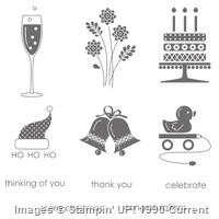
As of today, Stampin’ Up! Embellished Events stamp set (and ALL retiring stamp sets and accessories) will only be available while supplies last. Please be sure to check out what’s still available HERE (select items up to 50% off) and purchase your favorites before they are gone!
STAMPIN’ PRETTY TIPS:
- I used a sentiment from retiring Embellished Events stamp set for each of these notecards.

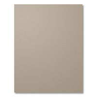
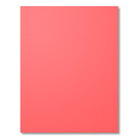
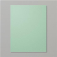
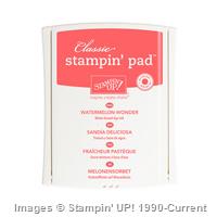
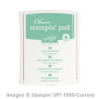
Spring: Mint Macaron, Watermelon Wonder, Tip Top Taupe
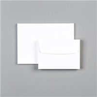
- Stampin’ Up! Note Cards & Envelopes are simple to stamp and embellish–a perfect solution for a quick card.

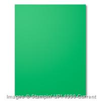
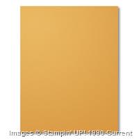
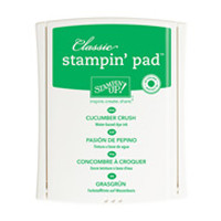
Summer: Cucumber Crush, Mint Macaron, Delightful Dijon
- When I introduced the 2015-2017 Stampin’ Up! In Colors in this post and video, I shared ideas for seasonal color combinations. I put those combinations together by season on today’s cards.

Winter/Holiday: Tip Top Taupe, Cucumber Crush, Watermelon Wonder
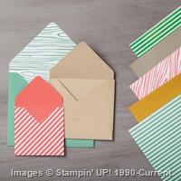
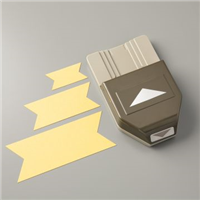
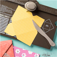
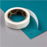
- Sneak Peek! I’m also showing off one of my favorite new products, 2015-2017 In Color Envelope Paper. It’s lighter weight and works beautifully with the Stampin’ Up! Envelope Punch Board to create just the size you need in envelope-friendly patterns and color. I also used a touch of the striped pattern for each of the striped banners.

Spring: Mint Macaron, Watermelon Wonder and Tip Top Taupe
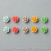
- Sneak Peek! Each card received an In Color Blossom Accents embellishment in coordinating colors!
SUBSCRIBE TO MY NEWSLETTER! Sign up and receive my exclusive monthly host code to earn a FREE gift when you place a qualifying order thru me.


MY STAMPIN’ UP! SUPPLY LIST. Please click on Stampin’ Up! products below for more details and easy on-line shopping. Sneak peek products will be available for purchase June 2 and you can track with this wish list form. Embellished Events stamp set is only available while supplies last.
Built for Free Using: My Stampin Blog





Thanks, Robbye. Your feedback warms my heart! I use my smart phone (Samsung Note) and PicMonkey or Picasa photo software. The background is simply a big piece of White Foamie 🙂 A couple of clamp lights help brighten the space but I usually need to brighten my photos (software) using a highlight tool!
I absolutely love this card! I tend to gravitate towards neutrals and other subtle colors with a pop of color to add that unexpected wow. How do you get such great photos of your cards? They’re always so crisp and clear.
Loving the color combination you came up with for both the Holiday and the Spring cards. Both cards pack a great punch and make a WOW kind of statement.
The beauty of the new colors is that you can use them together or combine with the existing colors. I find a good rule of thumb is the brighter the color, the better it adapts to neutrals. Thanks for your feedback!
Beautiful and Simple cards, amazing the way you combine colors Mary, your designs are always clean and colorful.
I like your use of the new colors together. I like them but am struggling with using them together. Your eye for simple design continues to WOW me.