 Welcome to a new Mojo Monday Sketch Challenge (MOJO190). This classic design worked beautifully with the Happy Greetings sentiment (Stampin' Up! Summer Mini Catalog). I grabbed my Blossom Bouquet Triple Layer Punch for the sweet floral accent on the right. Click for the Triple Layer Punch Video Tutorial I shared last week.

STAMPIN' PRETTY TIPS:
- I love fashion catalogs for inspiration. This adorable dress inspired both my color choices and all the scallops.
-

 Stagger each row of scallops and cut off the excess on the edges after you adhere them to card stock. You'll get a clean edge that way without needing to measure.
 - Using the Scallop Trim Border and Corner Punches together takes practice. I relied on this Border and Corner Punch Chart to create the mat for the sentiment.
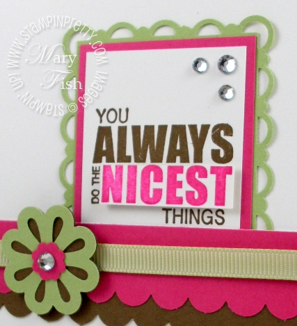
- Know when to hold up. I debated on whether to pop up the word "NICEST" in Melon Mambo. It's a fun alternative if you want a little extra spark. Which version to you prefer?

JOIN MY STAMPIN' PRETTY PALS AND SAVE thru May 31. Learn more about the 
CLICK TO ORDER STAMPIN' UP! PRODUCTS ON-LINE 24/7!
 Stamp Set: Happy Greetings (W123311, C123313)
Paper: Melon Mambo (115320), Soft Suede (115318), Whisper White (100730), Certainly Celery (105125)
Ink: Soft Suede (115657), Melon Mambo (115656)
Cool Tools: Blossom Bouquet Triple Layer Punch (122464), Scallop Edge Border Punch (119882), Scallop Trim Corner Punch (118870), Scallop Trim Border Punch (118403), Itty Bitty Shapes Punch Pack (118309)
The Perfect Touch: Jewels Basic Rhinestones (119246), Certainly Celery 1/4" Grosgrain Ribbon (109031), Stampin' Dimensionals (104430)


Beautiful card Mary! I just love the color combo and your sentiment is great! I can’t wait to get this set!!
I love the layout of this card! It’s simple yet it looks like it took a long time to make. Everything comes together nicely & complements the other!
~Shawnie
You ask a tough question, as I like them both. However, if I need to vote, I will go with the NON popped version and just one color for the greeting. I also like that you shared your inspiration picture. 🙂
Mary, I love this card! Great colors – love that you showed the inspiration piece! That is an awesome stamp set, too 🙂
luv this and the many colorful layers…perfect fun card! Hope your week is awesome!
enjoy *~*
Cute, cute, CUTE! I like the flat version of the sentiment the best.
I prefer the non-popped-up (Soft Seude) version of “nicest.” I find that the scallops themselves provide plenty of color such that no popping is needed.
Love it! I prefer the non popped up version. Less is more with all those beautiful scallops!
Sweet card, Mary! Love all those scallops and love how you shared the inspiration photo!
Now I not only want your card, I want that dress, too!!! 🙂 So fun to see where your inspiration came from, Mary. I love coming to your blog – it’s so fresh and clean. As for ‘Nicest’ – I like both the brown (classy) and the popped-up-pink (sassy); I’m easy! Have a wonderful day!
While I like the popped word in general, for this card I think keeping the sentiment the same color works better. It keeps the sentiment from having to compete with the colorful back ground. These are gorgeous colors, by the way.
i always love a pop in a word on a card but for some reason your right…..your card without ‘nicest’ popped looks best. great job
These are great colors together – very fresh and clean! Love all of the scallops!
What a great idea for my tower of scraps! Thanks again Mary.
What a cute card! Love the colors! You are so creative!
Fun card! Love how you got your inspiration and it worked beautifully!
Thanks for the Borders and Corner Punch Chart – very useful! As usual, this is a great card.
Great card…great colours! Wow!
Love the colors on this card. The scallops really make the card pop!